
Spring Valley Swap Meet Rebrand & Brand Guide
A brand building exercise where students had to research and develop an existing local brand to rebrand. Creating new elements for the brand such as: logo and variations, type and color systems, icons, illustrations, social media posts, stationery, mobile/desktop sites, and a brand guide book.
Brand Overview
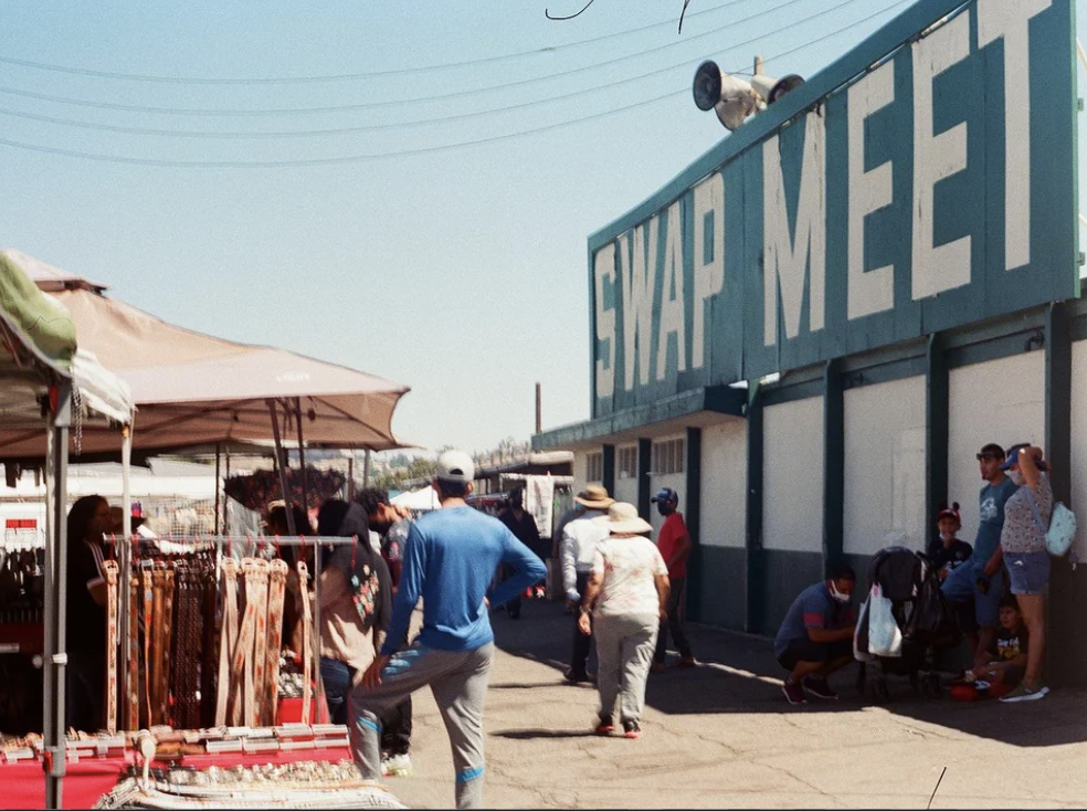
Spring Valley Swap Meet is an open air flea market in the heart of Southeast San Diego. The swap meet provides a dynamic and budget-conscious shopping experience where locals and visitors can find hidden gems, enjoy delicious food, and engage with a bustling market of local vendors—all in a thriving hispanic community.
Personas & Audience
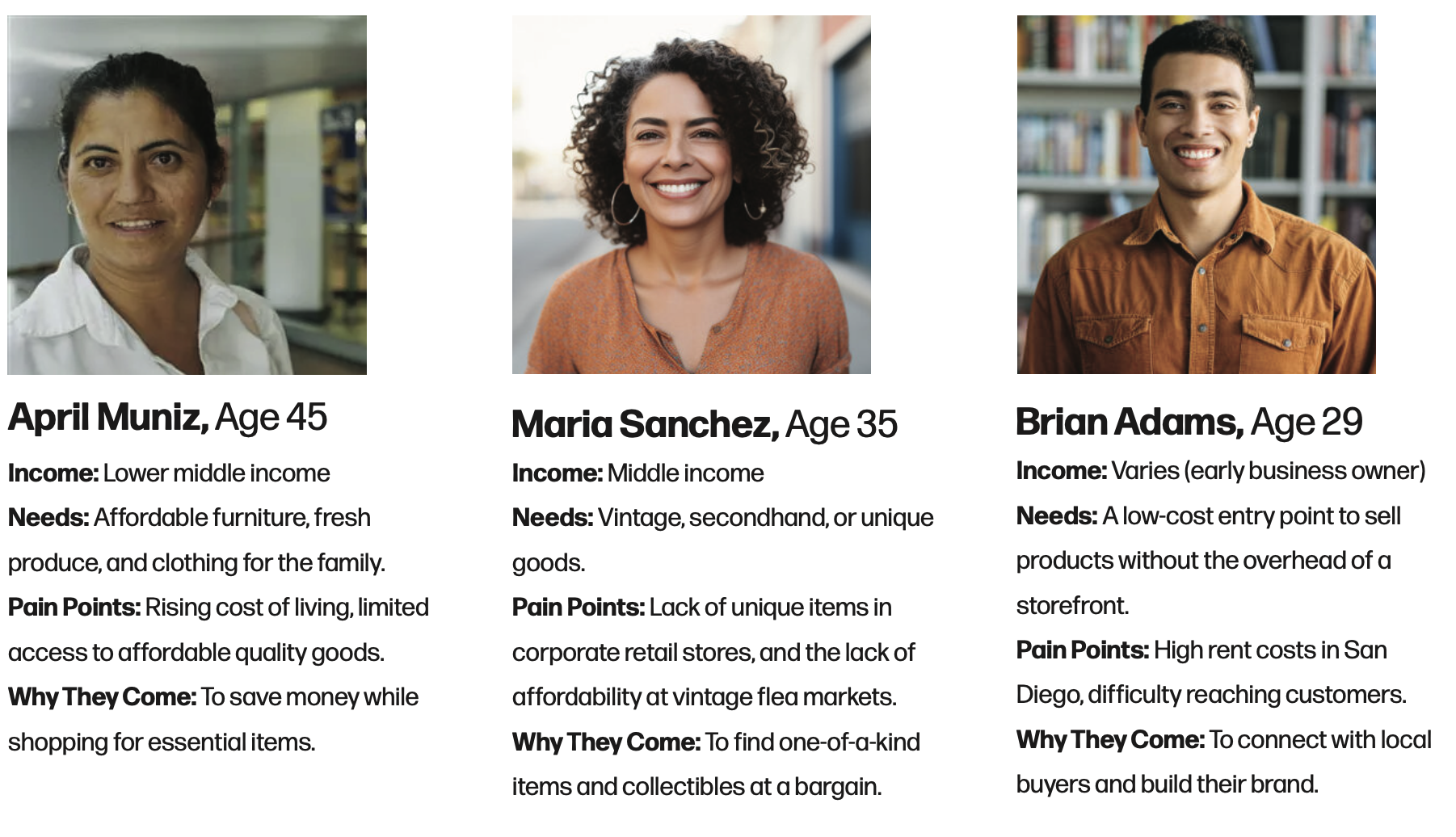
Personas & Audience
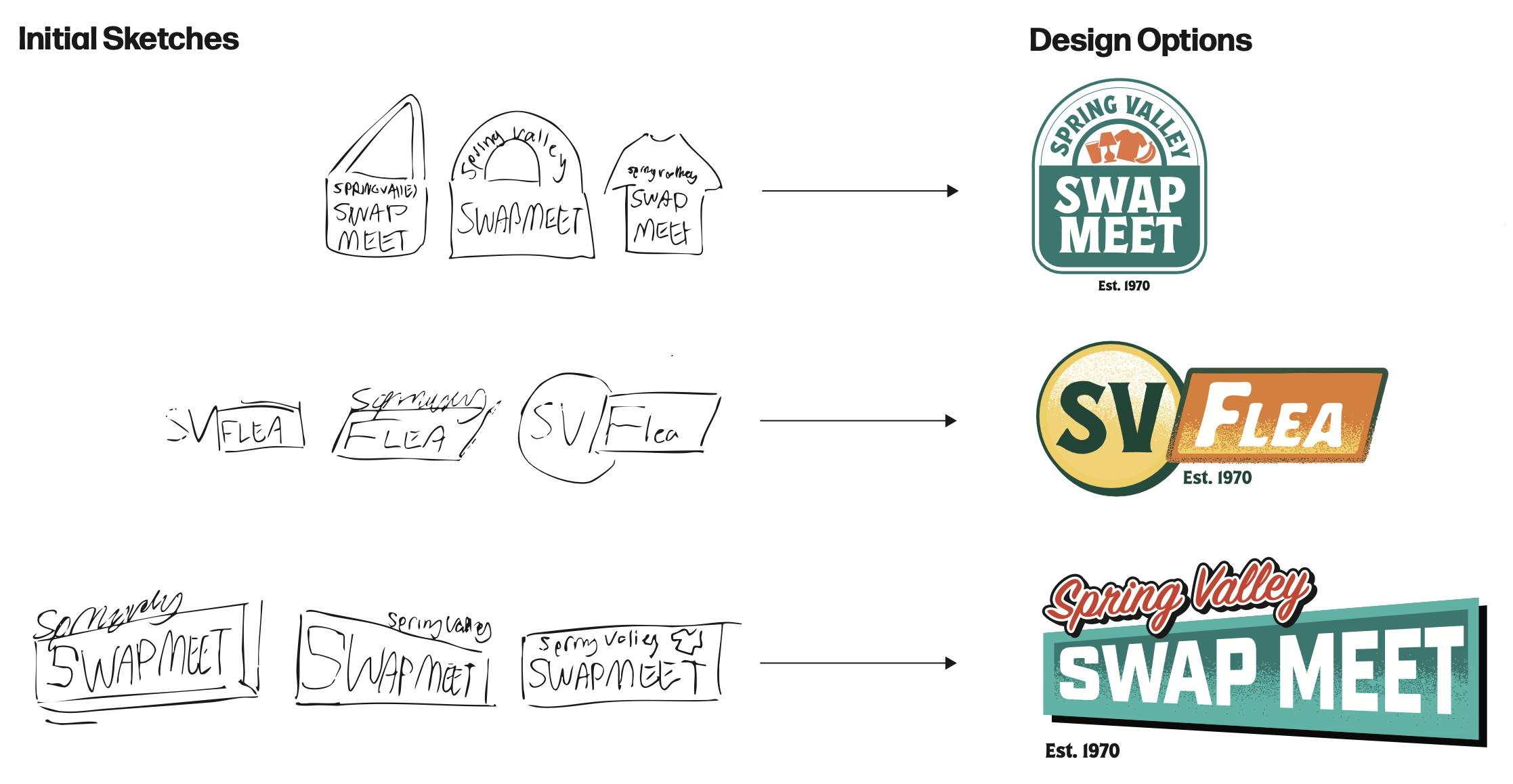
Final Logos
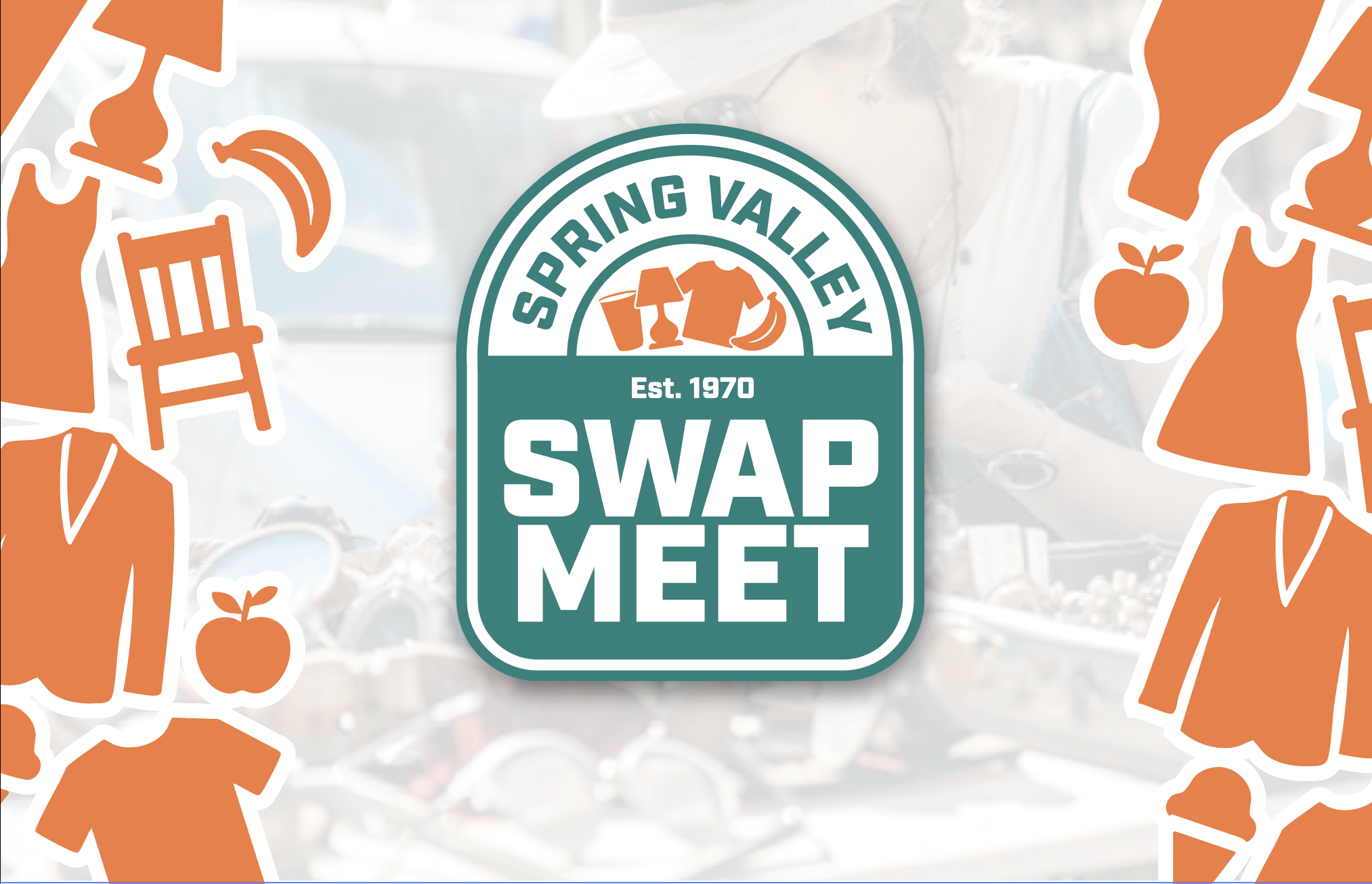
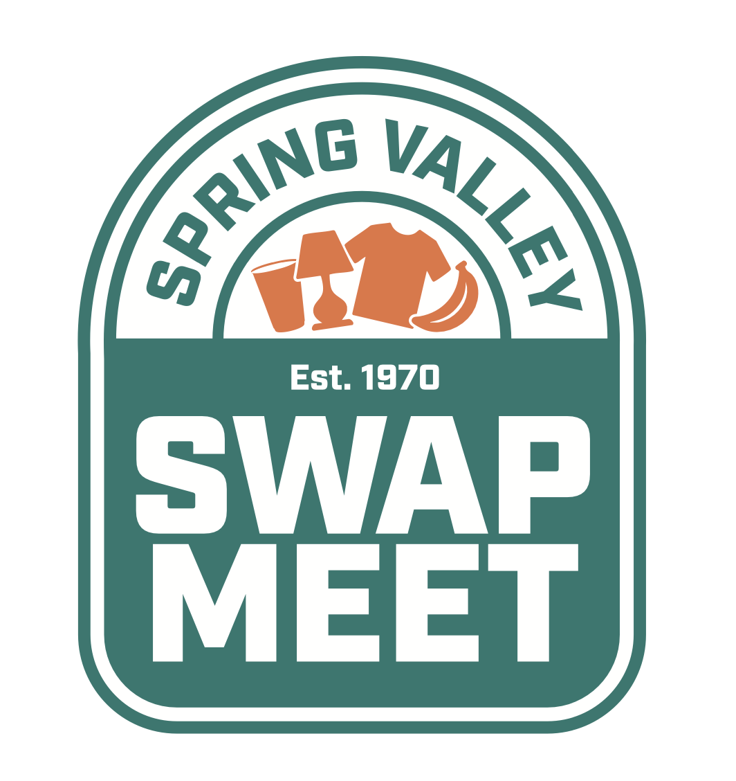
Primary (Master) Logo
The master logo is an emblem that takes heavy inspiration from the form of a shopping bag, where the “Spring Valley” is sat in the handle and “Swap Meet” sat in the body of the bag.
Another big point of inspiration is Spring Valley Swap Meet’s classic big green sign that spells out “SWAP MEET” in bold white text, in the same typeface and on the same green color you see utilized through the whole brand.
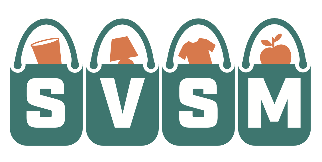
Secondary Logo
The secondary logo takes form of a horizontal wordmark, displaying the acronym “SVSM” for Spring Valley Swap Meet. It is necessary for the master logo to be used before this secondary logo, or if the dimensions don’t allow for the master to be used.
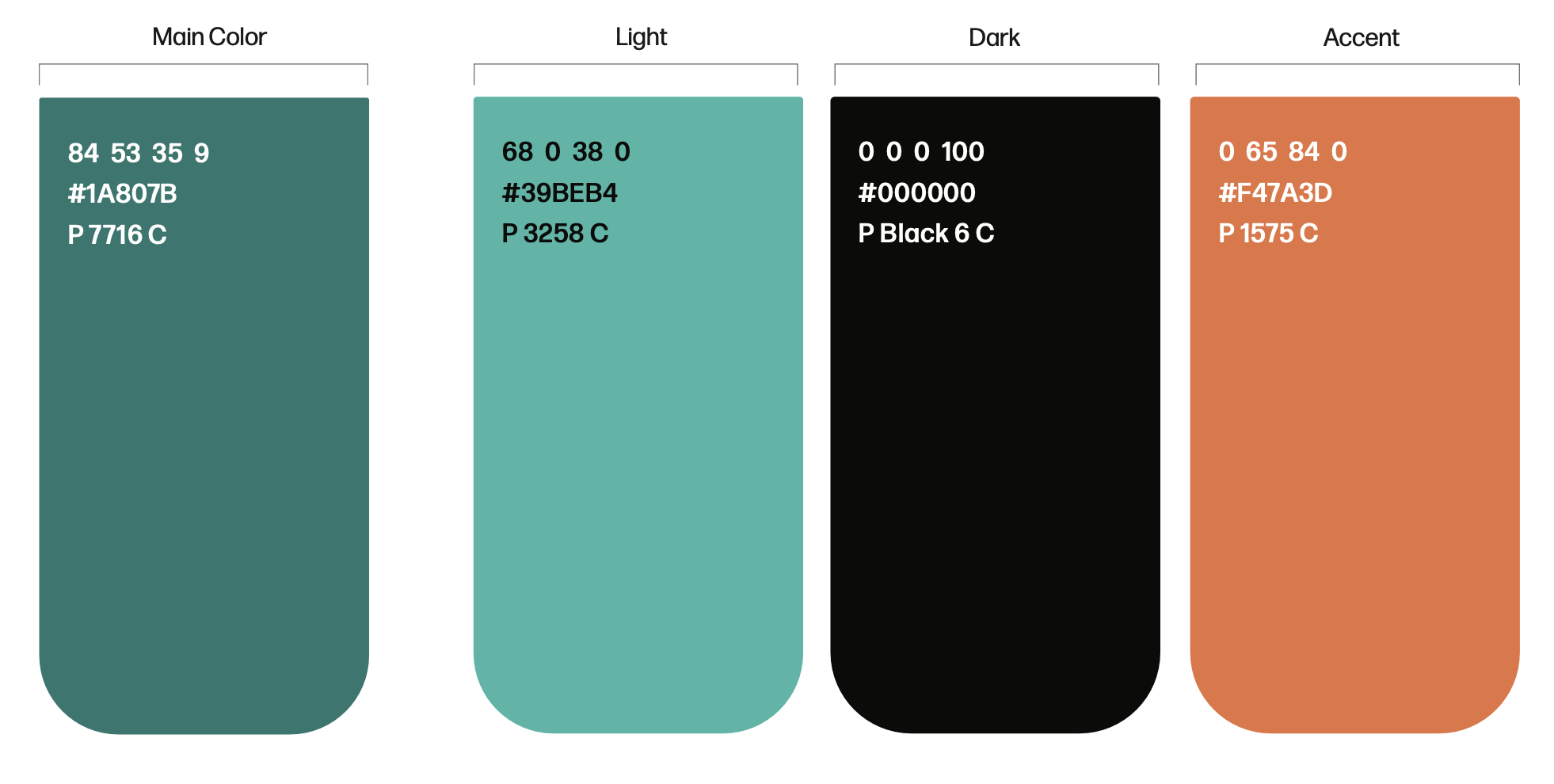
Color Palette
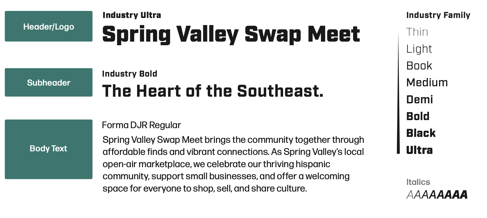
Type System
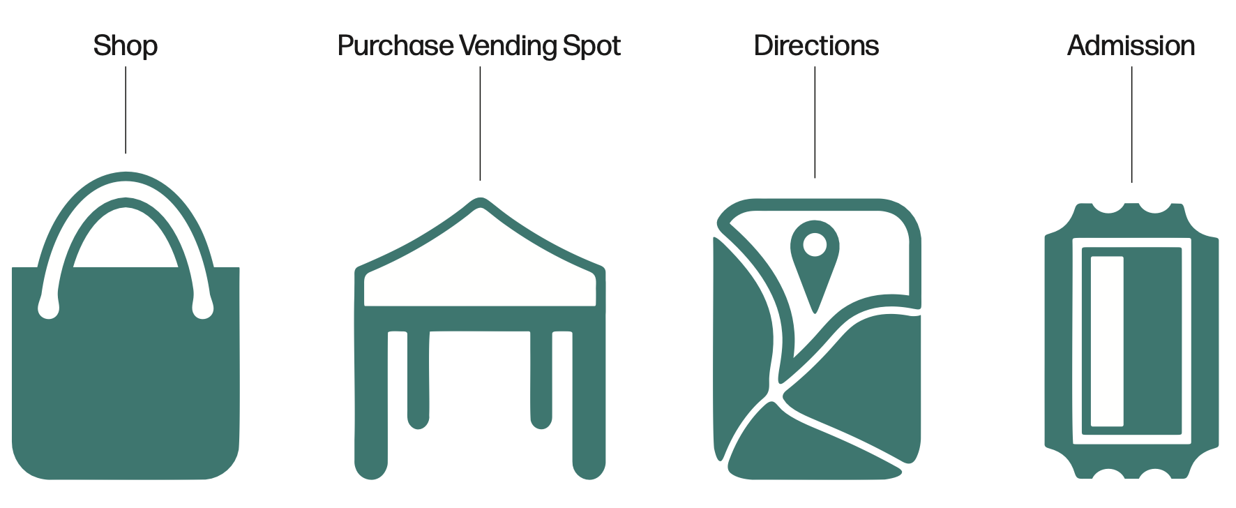
Icons
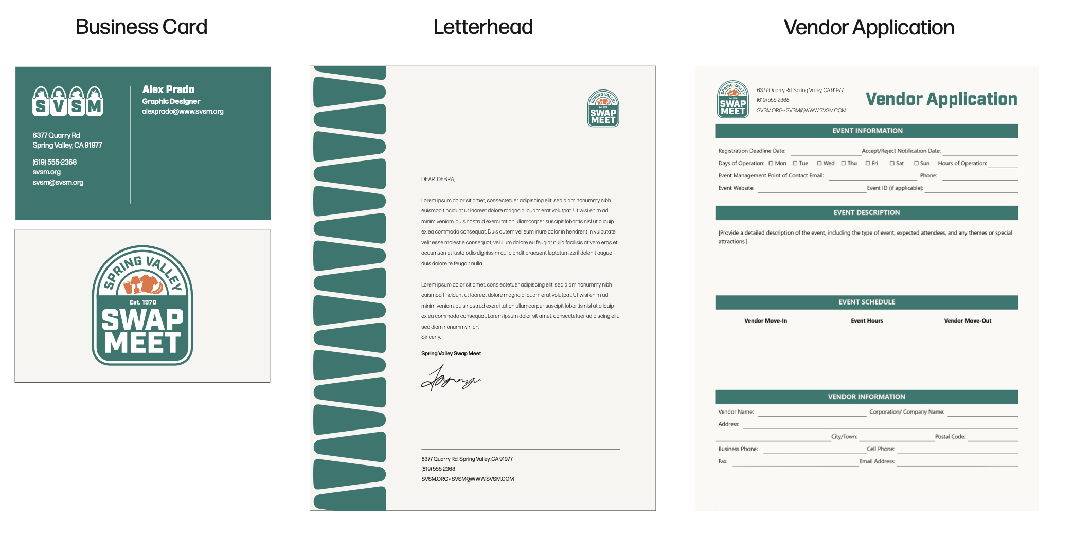
Stationery
Functional Site (Home Page, About, & Shop)
(Please view on desktop!)